Branding
National park Rebranding
Unigrid
Information Design
Educational
Project Overview
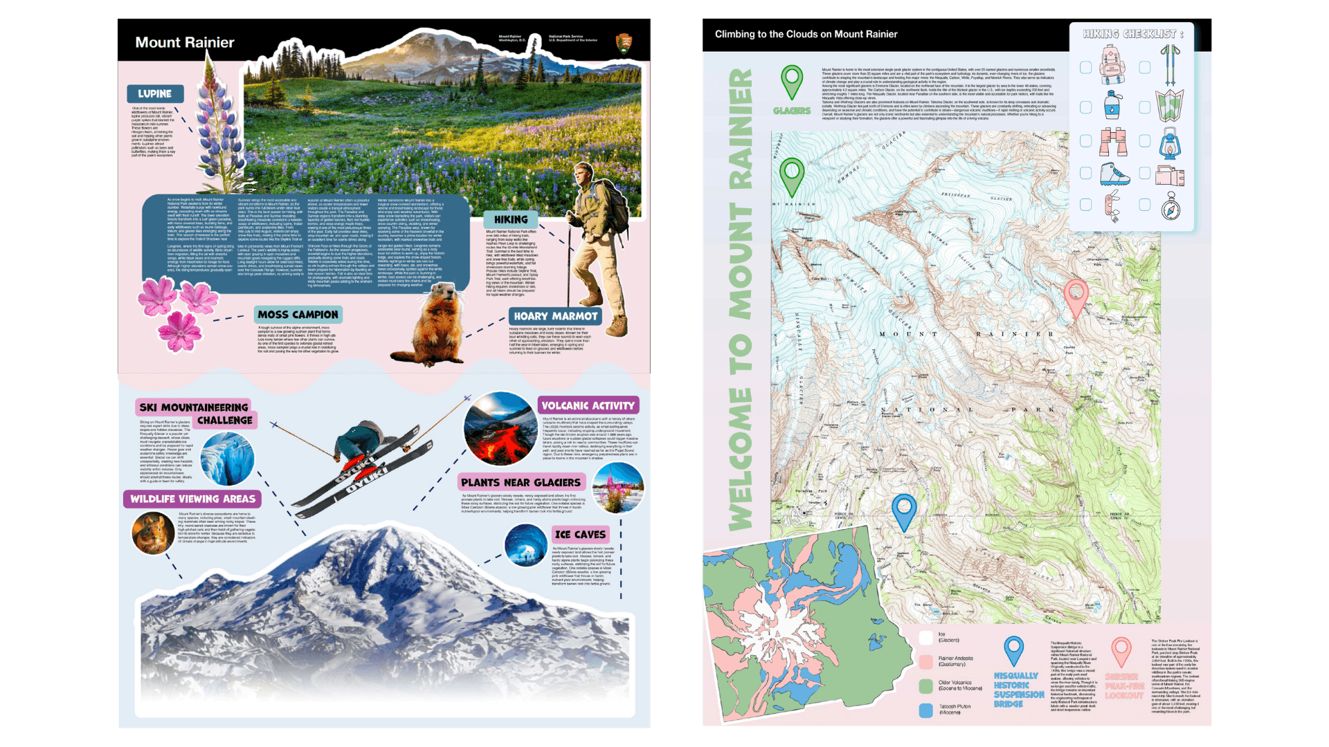
This project reimagines informational materials for Mount Rainier National Park using the National Park Service Unigrid system as a foundation. The redesign maintains the core Unigrid structure, such as the black header bar and column based layout, while updating the visuals for a more modern, engaging, and visitor friendly experience. Custom icons, color accents, and reorganized content improve clarity, readability, and navigation, making park information easier to understand for first time visitors while staying true to the Unigrid.

UNIGRID REDESIGN
This redesign preserves the integrity of the National Park Service Unigrid while introducing a refreshed visual language.
The updated layout balances structured information with playful illustrations and color coding to guide visitors through maps, landmarks, and key park details. The goal was to enhance usability without sacrificing the clarity and consistency that define the Unigrid.
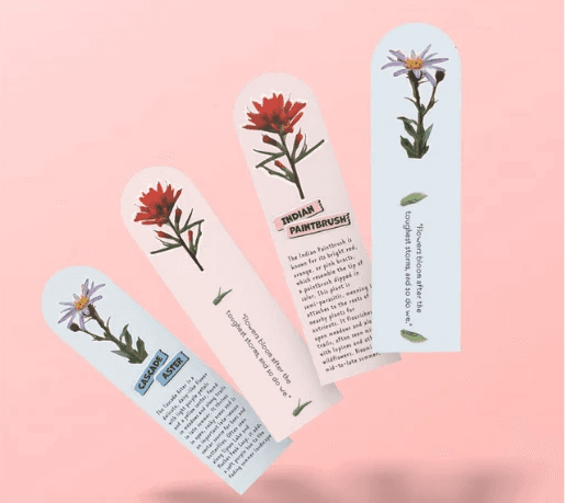
INTERACTIVE BOOKMARK SET
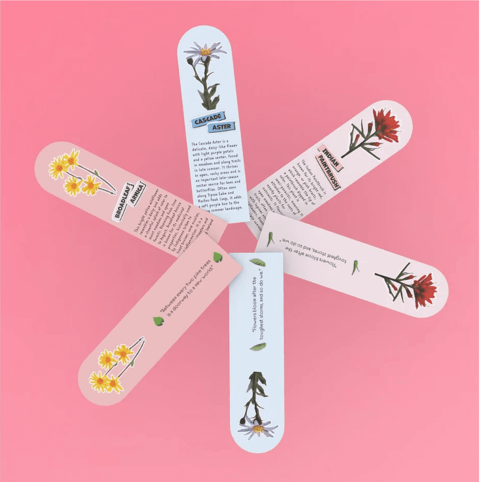
Inspired by native wildflowers found in Mount Rainier National Park, this interactive bookmark set highlights plants such as the Cascade Aster and Indian Paintbrush. Each petal shaped bookmark features a botanical illustration and a short fun fact to educate and engage readers. Designed to fan out like a flower, the set functions as both a practical reading tool and a playful keepsake for nature lovers and park visitors.
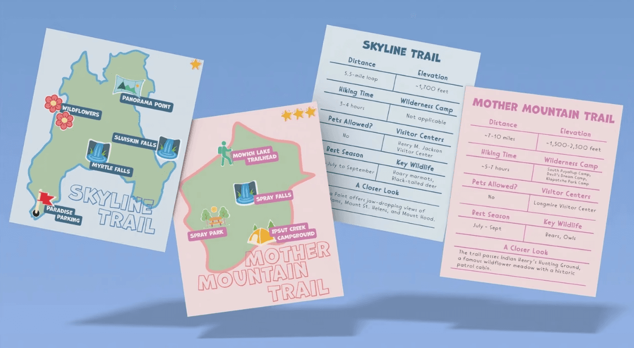
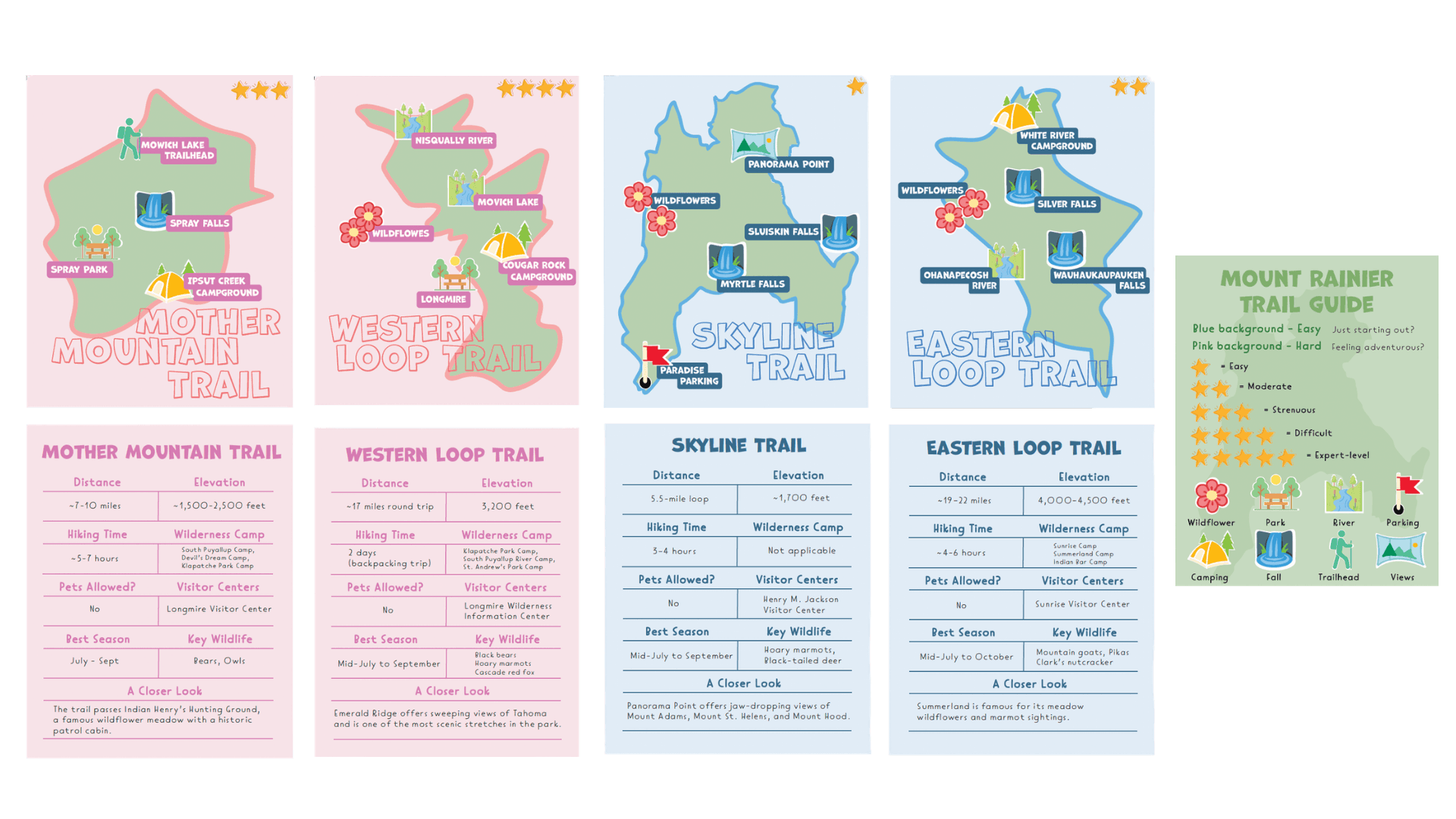
TRAIL GUIDE
This trail guide set includes illustrated maps and quick reference information cards for two popular hikes, Skyline Trail and Mother Mountain Trail. Designed with first time hikers in mind, each card clearly presents trail distance, elevation, key stops, pet policies, and seasonal tips.